
Wednesday, November 24, 2010
Monday, November 1, 2010
Lab 9b: Spatial Analysis
1. There are 99 counties in Iowa
2. Fulton County
3. There are 31 cities
4. They are 4,105.6 miles long
5.
6. 1,441,652.8 acres of urban area are within LA county
7. 522 zip codes have their centroid in LA county
8. Kitigan Zibi Indian Reserve and Akwesasne Indian Reserve

9.

2. Fulton County
3. There are 31 cities
4. They are 4,105.6 miles long
5.

6. 1,441,652.8 acres of urban area are within LA county
7. 522 zip codes have their centroid in LA county
8. Kitigan Zibi Indian Reserve and Akwesasne Indian Reserve

9.

Lab 9A: Spatial Analysis
Part I. Boldstad Chapter 9 and Lecture
1. Spatial scope is the extent or area of the input data that are used in determining the values at output locations. The three types of spatial scope include local operations, neighborhood operations, and global operations.
2. The two types of algebra used in selection operations are set algebra and Boolean algebra. An example of set algebra would be “<” (less than). An example of Boolean algebra would be “and”, which narrows the selection.
3. The different spatial selection operations include: adjacency, containment, dissolving, overlay analyses (clip, intersect, or union), buffer, and spatial join.
Part II. Ormsby Chapters 10 & 11
4. Yes, there is a feature dataset in the geodatabase called “LosAngeles”
5. The features present include: PtDumeQuad, Vegetation, and Wetlands Part III. Exercise 1
6. There are 10,896 records
7. There are 9 records after the dissolve operation
8. There are 8 records in the “vegCov_Clip” feature class
Part IV. Exercise 2
9. 404 records were selected
10. 123 records were selected

Tuesday, October 26, 2010
Lab 8: Database Management and Queries
Boldstad Chapter 8 questions and answers
1. A database management system is a specialized computer program for organizing and manipulating data. It stores the properties of geographic objects and the relationships among the objects. Additionally, a DBMS incorporates a specialized set of software tools for managing tabular data, including those for efficient data storage, retrieval, indexing, and reporting.
2. In a one-to-one relationship, only one record connects to another. In a many-to-one relationship there are several records connect to one other record in a different table.
3. Relational databases prevent redundancy, increase data quality and independence, they create centralized control, and they allow multiple users.
Ormsby Chapter 8 & 9
4a. String data (because it’s left-justified) Also, this can be determined by opening properties of layer and looking at fields (this tells you the data type)
4b. This is also string data
5a. LU_Description, LU_General, LU_Type, Sq. miles, and Acres are the fields that have been joined
5e. Total acres: 92,236.77


Monday, October 11, 2010
Lab 7: Map Design and Text
Chapter 7
1. The information used for dynamic labels is based on layer attributes
2. The most efficient way to show city names for only 3 cities would be to use the label tool. To do this select the label tool and locate the city that you want to label. Click on the city you want to label and a label will automatically appear.
3. Yes, you can manually adjust the position by clicking on the label and moving it using the mouse. You can also right-click on the label and select “nudge object”. Finally, you can move the object by clicking on the label and using the arrow keys to move the label.
4. The select tool
5. Geodatabase and map annotation are the two annotation types
Chapter 18
1. A. true (you can create your own ArcMap templates)
2. Yes
3. One way is to start ArcMap and click the option to use a template, then click OK. Another way is to open a new document and select “template” in the drop-down menu.
4. You would click the symbol for the layer that contains your graphics. Using the symbol selector you can then change the size, symbol, and color.
5. You can select the symbol selector or you can select the fill color in the drawing toolbar.
Chapter 19
1. You should set the page size
2. Because there can be multiple data frames within layout view, you set the scale differently in layout view than in data view.
3. Three customization options for the scale bar include: the units, the number of divisions, and the number of subdivisions
4. It is important to use the 1:1 button to get a full view of how the map will look when it is printed.
5. A graphic added to the data view would track with the data frame when it is moved in layout view. A graphic added to the layout view does not move with the data frame.
Part 2:
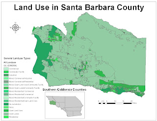
1. Choropleth maps classify numerical data into categories and the categories are shaded. This type of map puts visual emphasis on the largest area units of the map.
2. The benefits of layer files are that they allow you to define symbol assignments, classifications, labeling rules, and other map use properties.
3. Layer files include all map display properties for symbolization and labeling. However, layers do not usually contain the actual datasets. A layer package, on the other hand, contains the map layer, a copy of its data, and an SML file that has a brief description of the layer.
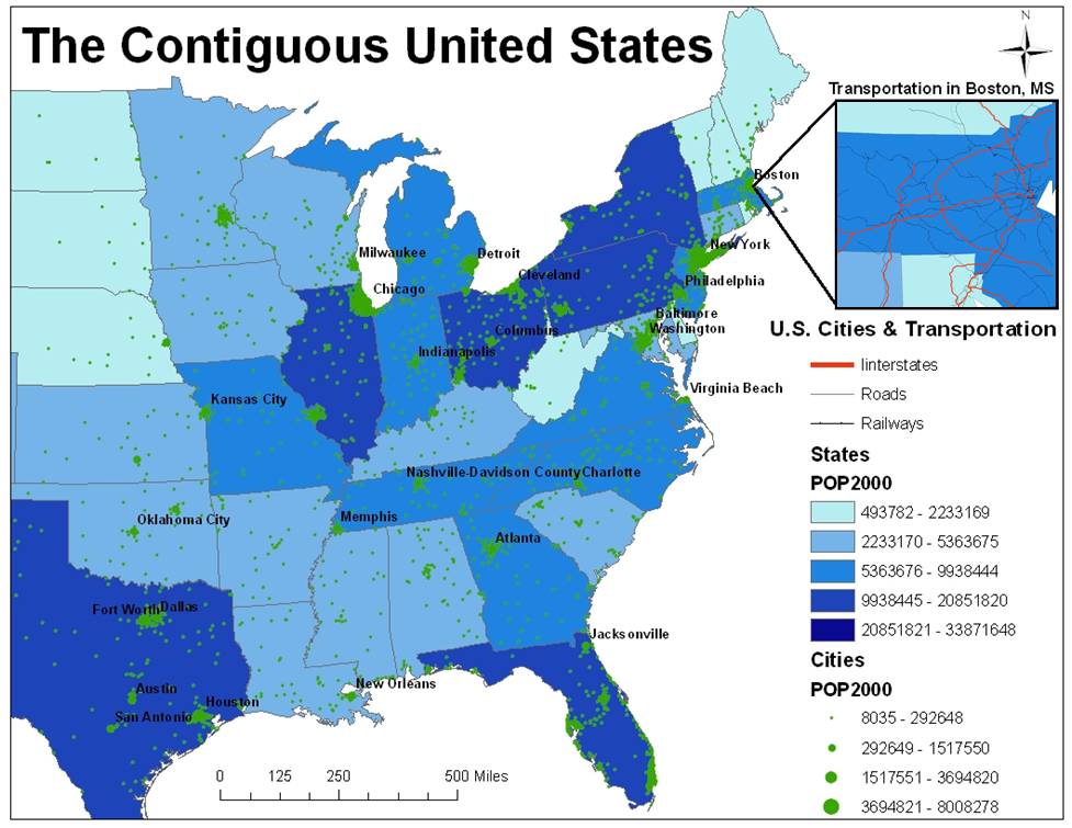
4. Population of Long Beach: 461,522
5. Population of Los Angeles: 3,694,820
6. The three types of hyperlinks include:
Document: When you click a feature with the Hyperlink tool, a document or file is launched using the application with which that file type is currently associated.
Uniform resource locator (URL): When you click a feature with the Hyperlink tool, a Web page is launched in the default Web browser.
Macro: When you click a feature with the Hyperlink tool, a value is sent to a macro. This option lets you create customized hyperlink behavior.
Wednesday, October 6, 2010
Lab 6: Symbolization and Classification

1. Depending on the scale at which you are viewing a map, the map features may appear different. For instance, if you are viewing a map of the United States at a small scale (ex.1 : 2,000,000), then cities may appear as tiny dots on the map. However, if you were to zoom in on a particular city at a large scale (ex. 1:200,000) then the city’s symbol may appear as a large polygon.
2. One way to change the layers symbol colors is by right-clicking the symbol for the layer to open the color palette and changing the color using the color palette. Another way is to right-click the layer and select properties in the drop-down menu. Then click the symbology tab in the layer properties dialog box. Next click the symbol box and change the color there.
3. To access graduated symbols open the layer properties dialog box for a specific layer. Then click the symbology tab and in the show box click quantities.
4. Five other symbology styles include: caves, civic, crime analysis, dimension, and environmental.
5. You would save the layer as a layer file. This allows you to add the layer file to any other map because it references the shapefile.
6. Pyramids help raster data display faster by varying the resolution of the raster dataset depending on the scale that the map is being viewed at. As you zoom in finer resolutions are used and as you zoom out courser resolutions are used. This improves the drawing speed of the raster layers as you zoom in or out.
7. You can click on the layer name in the table of contents and change the name that way.
8. Normalization is an operation by which you divide one attribute by another to find the ratio between them. It is used to calculate density and other measures that are expressed per unit (ex. Per capita income).
9. Dot density maps can be misleading because the dots on the map may lead a person interpreting the map to think that the dots are georeferenced. However, the dots are placed randomly on a map and are not georeferenced.
Wednesday, September 29, 2010
Lab 5: Digital Data
I. Questions based on lecture and book
1. Advantages of using digital spatial data include the following: it’s the easierst, quickest, and least expensive source for much spatial data. The disadvantage of digital spatial data is that because it is so readily available, you must check the source and metadata to make sure the data is reliable.
2. You must make sure that the coordinate projection system is the one that you need to use. You should also make sure that the data was collected and assembled by a reliable source. You should make sure that you’re using the most up-to-date version of that data by checking the metadata. You should check to make sure the resolution is good for what you want to do.
3. DOQs are images that have been corrected for distortions due to camera tilt, terrain displacement, and other factors.
4. The national elevation dataset is a seamless high resolution DEM of the United States produced by the USGS. This information is derived from both ground and aerial surveys. The National Hydrologic Dataset (NHD) compines data from USGS digital line graph data and the US EPA river “reach” data to create digital spatial data about surface waters including rivers, streams, canals, ditches, lakes, ponds springs, and wells. NHD data come from both ground and aerial surveys. National wetlands inventory (NwI) data are produced through a combination of land and aerial surveys as well This data is produced by the US Fish and Wildlife Service and they portray the characteristics of wetlands, including open water.
5. DEMs, or digital elevation maps, are data models in a raster format that provide elevation data. DEMs can be low or high resolution. DEMs make up the NED, national elevation dataset. The NED provides the highest-resolution DEM data for the United States and this data is seamless.
II. Answers to lab exercise
2a. The feature datasets are called “basemap” and “hydrology”
2b. The feature classes are NHDFlowline, NHDPoint, NHD Waterbody, and Watersheds
2c. NHDFlowline: line, NHDPoint: point, NHD Waterbody: polygon, and Watersheds: polygon
3a. Vector layer (metadata: description: expand data storage and access information: type of data)
3b. vector layer feature class, specifically a shapefile
3c. Yes
3d. Vector feature class
3e. Yes
3f. 3 keywords: hydrography, stream/river, and lake/pond
3g. Earth Science Information center, USGS
4. yes
6b. 34118-B5
7. black and white
8.

10.
12a. The lacount_lu01.shp layer was grayed out and had a red exclamation point next to it because it couldn’t find the data source
12b. To redirect the layer to the new data source name I right-clicked on the layer and selected properties. Then, I selected the source tab, set data source, and finally the lab 5 data folder and the correct data source.
Wednesday, September 22, 2010
Lab 4: Map Projections


If you imagine peeling an orange and attempting to lay the orange peel flat on a table, you can see that it cannot lay flat without breaking and tearing. The same is true of the earth’s surface because it can’t transform from a sphere to a plane. Thus, it’s impossible to make a completely accurate representation of the earth’s surface on a flat map. A map projection is a solution to this problem. It is a two-dimensional representation of the coordinate locations from the earth’s curved surface. Map projections are necessary in order to create maps. One way to picture the creation of a map projection is that it is formed as if someone is shining a light through the projection source (i.e. a globe) and the image that is projected on the flat surface is the map projection. The flat surface that the image is projected onto is called a developable surface. This surface is then “unrolled” in order to create flat map. There are many types of map projections, but the most useful map projections for GIS are based on developable surfaces. Some examples of the most commonly used developable surfaces are cones, cylinders, and planes. Names of map projections correspond to these developable surfaces, for instance, a map projection based on a cone developable surface is called conic. Instead of using a light to create a projection, cartographers use mathematical formulas to create accurate map projections.
Map projections inevitably become distorted because they attempt to take a curved surface and make it into a flat surface. For instance, one part of a map can be squished into a smaller area while the other part of a map is expanded. Therefore, if you were to measure the distance between two points on a map distorted in this fashion the distance may be smaller or greater than the actual distance. One way to measure the amount of this distortion is by using the great circle distance. The great circle distance is the distance between two points on the earth’s surface measured along the curved surface of the earth. This is then compared to the grid distance, which is the distance between two points measured along the projected surface. The difference between the great circle distance and the grid distance represents the distortion of the distance caused by the map projection. Factors that influence the distortion of the map projection include: the location of the projection source, the shape of the surface onto which we are projecting, and the location of the projection surface in relation to the globe. However, the significance of map projections is that they aim to reduce this distortion to the extent that this is possible. Map projection aim to preserve, shape (conformality), direction, distance (equidistant), and area (equivalence) without distortion. A map projection that attempts to maintain shape and direction is called a conformal map projection. Map projections that preserve area are called equivalent, or equal area, projections. Map projection that preserve distance over a short area but do not preserve area or shape are called compromise or equidistant projections. Finally, map projections in which all properties are distorted, but the map looks nice, are called perspective projections.
The map projections I used to represent conformal map projections were the Mercator and Gall Stereographic map projections. The Mercator map projection is famous for distoring the size and shape of large objects near the poles. Thus, Greenland appears just as large as Africa, even though Africa is 14 times the size of Greenland. Similarly, the Gall Stereographic conformal map projection that I used also has an exaggerated scale closer to the poles, but to a lesser extent than the Mercator projection. The stereographic projection which is the conformal azimuthal projection, stretches the northern and southern parts of the map horizontally. The Mercator projection expands the distance between Baghdad, Iraq, and Washington,D.C. in comparison to the Gall Streographic projection. The Gall stereographic projection compresses the distance between these cities. The equidistant world map projections I used were the sinusoidal projection and the plate carree projection. The sinusoidal projection is a pseudocylindrical map projection that distorts the distance on the map between meridians such that the distances are smaller, however it preserves distances along parallels. The Plate carree equirectangular projection is centered at the equator and all parallels are equally spaced, as are all meridians. Since the sinusoidal projection compresses the distances between the meridians, the distance between Baghdad, Iraq, and Washington, D.C., appears smaller for the sinusoidal projection in comparison to the plate carree projection. The plate carree projection has equally spaced meridians and thus the distance between the selected cities is expanded. Finally, I used the mollweide and bonne map projections as the equal area map projections. The Mollweide projection is a pseudocylindrical map projection that compresses the parallels near the poles, but the other meridians are equally spaced closer to the equator. The Bonne projection is a pseudoconical equal area map projection in which the scale is only true along the parallels of latitude. From the map we can see that the distance between Washington, D.C. to Baghdad, Iraq, is more compressed on the Bonne projection. Since the Mollweide projection is more equally spaced closer to the equator the true distance between the selected cities is more accurately represented by the Mollweide projection.
Coordinate Systems and Projection Worksheet
1. What is an ellipsoid? How does an ellipsoid differ from a sphere?
It is the best fit for a particular location that approximates the surface of the earth. An ellipsoid is a mathematical surface based off of a semi-major and semi-minor axis. There are many ellipsoids approximating the earth’s surface that vary in shape because of geoidal variation in the earth’s surface. An ellipsoid is different from a sphere because an ellipsoid is a sphere that is flattened at the poles.
2. What is the imaginary network of intersecting latitude and longitude lines on the earth's surface called?
Graticule
3. How does the magnetic north differ from the geographic North Pole?
Magnetic north is where a compass points to and geographic North Pole is located at one of the poles of the earth’s axis of rotation. The difference between these north points is called magnetic declination.
4. Why are datums important? Briefly describe how datums are developed.
Datums are important because they provide a frame of reference for the ellipsoid models. Datums consist of two components, a specified ellipsoid and a set of surveyed coordinate locations specifying positions on the earth’s surface. To develop a datum one must painstakingly survey an area using the best methods and equipment. Datum points were first determined using celestial measurements. In more recent years, datum points are now determine by sophisticated electronic and satellite-based surveying systems.
5. What is a map projection?
A map projection is a 2-dimensional representation of the coordinate locations from the earth’s curved surface. Projections attempt to preserve, shape, direction, distance, and area without distortion.
6. What is a developable surface?
The flat surface that the image is projected onto is called a developable surface. This surface is then “unrolled” in order to create flat map. There are many types of map projections, but the most useful map projections for GIS are based on developable surfaces. Some examples of the most commonly used developable surfaces are cones, cylinders, and planes. Names of map projections correspond to these developable surfaces, for instance, a map projection based on a cone developable surface is called conic.
7. Which lines on the graticule run north-south, converge at the poles, and mark angular distance east and west of the prime meridian?
a. Lines of longitude
8. Which of the following ellipsoids is now regarded as the best model of the earth for the region of North America?
a. Clarke 1866
9. Which well known coordinate system would be appropriate to use for developing and analyzing spatial data when mapping counties or larger areas? Why?
State plane coordinate system projection. The state planes system limits projection errors by dividing states into zones. The zones are specified such that any projection distortions are kept below 1 in 10,000. This system reduces distortion that increases over larer distances.
10. What is a great circle distance?
The great circle distance is the distance between two points on the earth’s surface measured along the curved surface of the earth. This is then compared to the grid distance, which is the distance between two points measured along the projected surface. The difference between the great circle distance and the grid distance represents the distortion of the distance caused by the map projection.
Sunday, September 12, 2010
Lab 3: Data Formats and Models
1. A data model is a model constructed after abstraction decisions have been made. It is a model that describes and illustrates features of the actual world in a digital form. The two most commonly used data models are vector and raster data models. Vector data models are called discrete data models, they have distinct boundaries and are not continuous. Vector data models are made up of points, lines, and polygons. There are two types of vector data models: spaghetti and topological models. Raster data models are called pixelized data models that define features as a set of cells in a grid. Raster data models are good for processing multiple layers and probabilistic modeling.
2. Topology is the process of establishing proper relationships between the lines, points, and polygons that have been drawn. Topology is important because it ensures proper relationships between features such that all features on the map have the correct connectivity, area definitions, and contiguity. Once these relationships are properly established, the model can be bent and still have the same connectivity and adjacency. Additionally, topology is important because it results in more accurate analyses due to a better resolution of linear and point features.
3. The best type of data model for representing hillside slope would be a raster data model using continuous data. The data model would be able to show a gradual change in elevation between the grid cells. A vector data model would make it seem that the hill is made up of discrete steps of different elevations because there are discrete boundaries in vector data models. Additionally, it is more efficient to use a raster data model for elevation.
4. If the grid cell is very large then it has less resolution. For instance, a 30 m grid cell will not very accurately represent a 15-m wide river because it will double the size of the river. To avoid this you could either use a vector data model, or use small grid cells in order to increase the resolution of the raster data model.
5. Four types of attribute data include: nominal, ordinal, interval, and ratio. Norminal attribute data is categorical data, such as the name of a city. Ordinal attribute data is ranked data, for instance the rank of cities in terms of cleanliness. Interval data is data that is related to an arbitrarily chosen zero value, such as temperature in Celsius. Finally, ratio data is all other types of quantitative data with reference to an absolute zero, such as elevation data.
6. Two types of vector data file formats are shapefile (.shp, .shx) and interchange files (.eOO).
7. Two types of raster data file formats are Imagine (.img) and GeoTIFF (.TIF) files.
8. C. select features
9. The World.mdb geodatabase contains four feature classes
10. The names of the feature classes are cities, countries, disapp_area, and world30
11. The layer file called flight_diver ge depends on a spatial dataset called the flight_diverge shapefile.
12. One way to add data to an ArcMap document is to drag the file from the ArcCatalog view to the ArcMap display window and release the mouse button. Another way is to go to the file menu and select add data from the drop down menu (or select the add data button on the toolbar).
13.

Tuesday, September 7, 2010
Lab 2: ArcGIS and ArcMap
1. ArcMap, ArcCatalog, and ArcToolbox are the software products included in ArcGIS and we will be using ArcMap the most.
2. It would be better to create, symbolize, and analyze maps in data view. The layout view should only be used for organizing maps to be printed.
3. One way to obtain help is to click on the “what’s this” tool on the toolbar (or you can get to it through the help menu) and place the pointer over an object that you have a question about. Another way to get help is to go to the help menu and click on “ArcGIS Desktop Help” or press F1.
4. Attributes are linked to geographic features through an attribute table. You can get to the attribute table by right-clicking on a layer in the TOC menu and selecting open attribute table.
5. The file called a map document, “.mxd”
6. One way to zoom in is to click on the magnifying glass on the tools toolbar and then use the magnifying glass to click on a part of the map that you want to zoom in on. Another way is to use the magnifying glass to select a box that you want to zoom in on.
7. Three operation available include: label features, open attribute table, and zoom to layer.
8. This means that the data for that layer is not able to be viewed because the scale of the map is not correct. You would need to either zoom in or zoom out in order to view the grayed out layer.
9. A small scale map is, for example, a map of the United States in which the scale could conceivably be 1: 500,000. This is called a small scale map because the fraction 1/500,000 is very small. An example of a large scale map is a map of the CSUN campus, which might have a scale of 1:10 (a much larger fraction).
10. A feature is a geographic object in a layer. Features have a variety of shapes (polygon, line, or point) and sizes. Also, features are linked to information through an attribute table. A surface is a single, continuous geographic expanse, for example the ocean is represented by a surface. A surface is made up of different values for each location on the earth’s surface and is generally represented by a raster.
11. Create project criteria
12. The minimum elevation was at New Orleans and it was 0ft above sea level. The maximum elevation was at Tuscon and it was 1045 ft above sea level. In order to find these numbers I opened the attribute table for cities and organized the table by elevation.
13. The distance from Dakar to Assab is approximately 4,172 miles. You can determine the approximate distance by using the measure tool. I suppose you could also open the attribute table for flight path and sum the distances between each of the cities from Dakar to Assab. However, that would not give a very accurate measurement of the distance.
14. You could right click on the cities layer and select label features. This would label all of the cities shown on the map. Or, you could use the identify tool and click on a city to find out the name of the city.
15.
Monday, August 30, 2010
Lab 1B
1a) Definitions of GIS:
A geographic information system (GIS) integrates hardware, software, and data for capturing, managing, analyzing, and displaying all forms of geographically referenced information.
(Source: http://www.gis.com/content/what-gis)
A geographic information system (GIS), or geographical information system, is any system that captures, stores, analyzes, manages, and presents data that are linked to location. In the simplest terms, GIS is the merging of cartography, statistical analysis, and database technology.
(Source: http://en.wikipedia.org/wiki/Geographic_information_system)
Geographic Information System or GIS is technology that offers a radically different way in which we produce and use the maps required to manage our communities and industries. GIS creates intelligent super maps through which sophisticated planning and analysis can be performed at the touch of a button.
(Source: http://www.satimagingcorp.com/svc/gismapping.html)
1b) Similarities among definitions
These definitions are similar in that they all define GIS as a geographic information system, not geographic information science. Additionally, all definitions describe GIS as a way to manage spatial data. The one other aspect that is similar among these definitions is that they all mention the ability of GIS to analyze this organized spatial data.
One of these definitions is very different from the other two definitions in that it focuses primarily on the applicability of GIS to community and industry planning. The first two definitions presented are very similar, yet the second definition differs by mentioning cartography and database technology as components of GIS.
1d) What does this tell you about the field of GIS?
Because the definitions are all somewhat different it suggests that GIS is a relatively new field in which the definition has not been fully agreed upon. Furthermore, it suggests that there are many different aspects to and applications of GIS technology which may be difficult to encompass in one definition.
2) Three real world applications of GIS
In a study by Sposito et al. 2009, the authors used GIS to identify potential agricultural regions in the Southwest region of Victoria Australia that are under threat of decreased productivity due to climate change. In order to identify these potentially high risk areas the authors combined information about land suitability in the area with regional optimization analyses under the current and predicted future climatic conditions. This type of research is becoming increasingly important worldwide as climate is predicted to rapidly change in the next century. (Source: Application of GIS-based computer modeling to planning for adaption to climate change in rural areas by Sposito, V., Benke, K., Pelizaro, C. & Wyatt, R).
A second example of an application of GIS is demonstrated by the work of Adams (2007). This study investigated potential areas of land-use conflict in the central region of Australia's desert. In order to determine where these potential conflicts might occur Adams incorporated information about aborginal communities, tourism sites, pastoral leases, national parks land, and the degree of interest in the parcels of land. By overlaying information about each of these land types he was able to find potential areas of conflict. (Source: Exploratory GIS modeling for assessing potential conflict in Australia's central desert region by Adams, B. Jon)
A final example of a useful application of GIS is given in a study by Cloutier et al. (2007) in which the authors used GIS to determine if the occurrence of child pedestrian accidents are related to the distance to an elementary school. Cloutier and others combined socio-economic information as well as environmental data in order to integrate information about the local environment into a spatial analysis of child pedestrian accidents. They found that on average these accidents occur primarily within 500 meters of the closest school. This finding is important because in the future information about the neighborhood surrounding a school can be considered before placing a school in the area in order to minimize the risk of child pedestrian accidents. (Source: GIS-based spatial analysis of child pedestrian accidents near primary schools in Montreal, Canada by Cloutier, M., Apparicio, P., and Thouez, J.)
3) Three differences and three similarities between GIS and maps
Both GIS and maps use spatial data to give us a better understanding of where things are situated in the world. Additionally, both GIS and maps communicate information about attributes of spatial information through the use of symbols. Finally, GIS is obviously similar to maps because it incorporates the use of maps. However, GIS is different than a normal map because while it incorporates the use of maps it also adds additional data to the map to create a 'super map'. In other words, maps are concerned with the representation of spatial data, whereas GIS is more concerned with the analysis of spatial data. For instance, while a normal map shows a combination of layers all put together (streams, rives, county borders, etc), a GIS map stores each of these layers separately and puts the layers on top of each other to create a map. Finally, features of GIS maps can be easily manipulated to find the answers to complex problems through statistical analyses, this is something that would be very difficult if not impossible to do using normal maps.
Monday, August 23, 2010
Lab 1A
The map shown below is Figure 3A and 3B taken from Planes et al. (2009)*. Figure 3A shows a proposed network of marine reserves in Kimbe Bay, Papua New Guinea, which are represented by the red-dashed squares. The study in this paper used parentage analysis to determine whether larvae from the clownfish A. percula disperse from Kimbe Island to the distant proposed marine reserves. The arrows show that larval dispersal does occur between Kimbe Island and the proposed marine reserves, with the numbers (i.e. 4/39) representing the number of recently settled juveniles that are progeny of A. percula adults from Kimbe Island. Figure 3B shows the location of the A. percula adults whose progeny were detected at the distant marine reserves. I find this map and particularly this study interesting because larval dispersal is currently not very well understood. It is currently not possible to track larvae and thus we are forced to tackle the question of larval dispersal through indirect means, such as parentage analysis. This type of work is something I am interested in and hope to pursue in the future.
*Planes, S, Jones GP, Thorrold SR (2009) Larval dispersal connects fish populations in a network of marine reserves. PNAS 106(14): 5693-5697. 
This map, entitled Franko's Map of Los Angeles County, represents what I like to think of as a "diver's view" of the Los Angeles Area. I own this map and it can be found online at the following website: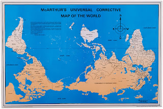

This map, entitled Franko's Map of Los Angeles County, represents what I like to think of as a "diver's view" of the Los Angeles Area. I own this map and it can be found online at the following website:
http://frankosmaps.com/maps/product/Frankos-Map-of-Los-Angeles-County-Coast.html
This map is a colorful representation of some of the most popular and also not well known dive spots that can be found off the coast of Los Angeles. The map describes different aspects of the dive sites shown from Ventura County line to Palos Verdes Peninsula. This map also depicts some of the fish that can be seen while diving in this area. I am a frequent user of the map, as I love to dive, and I have found that it does not often lead me astray.

The map shown below is called, "McArthur's Universal Corrective Map of the World". The map was found on the following webpage:

The map shown below is called, "McArthur's Universal Corrective Map of the World". The map was found on the following webpage:
http://www.odtmaps.com/detail.asp_Q_product_id_E_McA-23x35
The map offers a perspective on the world different from the "north-centric" or "euro-centric" view typically presented. Stuart McArthur made this map when he was 12 years old because he lived in Australia and had a different perspective on the world. I think this map is interesting because the "normal" view of the world with the north at the top of the map is completely arbitrary. This view apparently only came about because European navigators used the north star and a magnetic compass to navigate.

Subscribe to:
Posts (Atom)